Data Junkies, You'll Love This
-
-
slice.mit.edu
Filed Under
Recommended

The National Science Foundation's 2010 Science and Engineering Indicators (SEI) report is quite possibly the mother lode of data. SEI is a compilation of quantitative stats from a variety of national, international, public, and private sources that show the world's changing science and technology picture on a variety of fronts: education, labor, R&D, academic research, industry, and more.
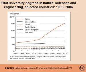
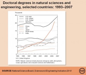
Among other things, the data indicate that developing and developed nations alike have firmly built science and technology into various economic, educational, and infrastructure policies to help boost economic viability and future global competitiveness. Represented here is just a tiny sampling of the myriad stats available.
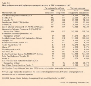
You can also find out public attitudes and understanding of science and technology, the economics behind U.S. exports and imports of commercial knowledge-intensive services, and the U.S. metropolitan areas with the highest percentage of workers in science and engineering occupations (below), which had one sophomore blogger for the MIT Admissions Office very excited.
Check out the statistics for yourself. The raw data are also available. Think of all the pie charts and graphs you can make!


