MIT Alumni Volunteers
Knowledge Base Search
PowerPoint Presentations
Simple Guidelines to Keep Your Content Clear and Concise
It is easy to make the wrong choices when building a presentation in PowerPoint and end up losing your audience or cluttering your message. We've put together simple guidelines and practical tips to help you easily make clean presentations.
Start With an Outline
 Building an outline helps you keep track of the main point(s) you want to cover in your presentation and plan the timing of each slide. Think of your slides as a visual overview to keep your audience on track or a place to illustrate statistical trends. The meat of the presentation should either be delivered by the presenter or be included in supplementary hand-outs.
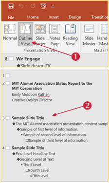
You can make an outline of your presentation before you start building it using Powerpoint’s Outline View. Click the View tab and select Outline View (1). You can edit the text on each slide directly from this viewer (2), while being able to see the entire presentation all at once.
Screen Size and Slide Size
Is this presentation being viewed on a laptop by a colleague offsite or over Zoom, on a large projection screen, or a small projection screen? Keep the presentation medium and the audience in mind when making your slides. If possible, try it out on the screen that you’ll be ultimately presenting on.
Slide sizes choices of 4:3 and 16:9 look very different, especially if your slides are being combined into a larger presentation. You can change this by clicking the Design tab and clicking Slide Size on the far right.
Word Limit Per Slide
Limit how much information you include on each slide to make the content easier to see and digest. Try this guideline: each PowerPoint slide should have one main idea, a maximum of six bullet points, and a maximum of six words per bullet point.
Fonts
San Serif fonts are easier to view on a screen as opposed to serif fonts (which are more formal and viewed more easily in print). Avoid using light text on a dark background unless it is only several words, as it is harder to read.
Keep your font size in the range of 36 – 60 pt if possible.
Slide Master
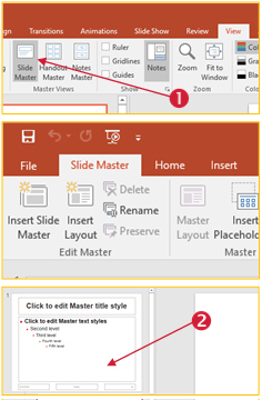 If you are not building a presentation from an existing template, use Powerpoint’s Slide Master View to easily establish consistent formatting throughout. On the View tab, click Slide Master (1). Here you can design a template for each type of slide that you’ll need in the presentation. You can still access the other tabs like the Home tab, allowing you to adjust fonts and colors. You can also make formatting changes to the entire presentation by only changing the top master slide (2). When you are finished, click Close Master Slide. When you are creating the actual slides, you’ll be able to select from the templates you build in the master view.
Colors
Try not to use more than 5 colors unless you are using them to show categories or sequences (different colors for the months of the year, categorizing goals or action plans) Determine a color scheme ahead of time and adhere to it with every slide.
Saving a Color Palette in PowerPoint
 To keep your colors consistent and easy to access, you can save a color palette in PowerPoint.
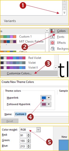
Click the Design tab and under Variants, click the down arrow (1). On the dropdown menu click Colors (2) and Customize Colors (3). In the Create New Theme colors dialogue click one of the color slots (4).
In the Colors window that opens, you can either choose a color or enter its Red Green Blue (RGB) code which consists of 3 numbers (5). Click ok and do the same for the next color slot. When you are finished, name your palette and click save.
You’ll be able to access this palette in any of the other Office programs. In Word (Design tab, Colors) and in Excel (Page Layout tab, Colors).
Images and Pictures
Use images sparingly unless they are the purpose of the presentation (for example: if you are putting together a slideshow of photos for or from an event), the less images you use the more space you have to clearly display your key points. Avoid animated gifs as they can be very distracting to your viewers when you want them to be focused on what you have to say.
When you do use images or graphics make them consistent (size, resolution, placement on the slide) Keep in mind that photos may not enlarge clearly if their resolution is too low, so it is safer to use vector graphics. It is also worth noting that the file size of pictures can decrease your ability to send your presentation over email.
Tips for Simplifying Content
NUMBERS AND CHARTS: Consider how you display large numbers. Simplifying numbers is the best way to keep your slide clear and deliver your message just as well (or better!)
- Delete decimal places if possible
- Round up or down if the exact number is not critical (for example, if you display $4036.65 in donations, your message still comes across and can be less cluttered if you say $4000)
- Write $4000 as $4K if you need to save more space
- If you are showing a general arc in number on a graph, try labeling every other column instead of all of them when there isn’t room. The idea will still come across.
TEXT: Use these tips from business writing techniques to get your point across in less words:
- Use bullet points instead of sentences (just make sure you use them consistently!)
- Use keywords and deliver the rest of your content verbally
- Check out this list of wordy phrases and their concise options
|
Replace… |
With… |
Replace... | With... |
|---|---|---|---|
|
the reason for for the reason that due to the fact that owing to the fact that in light of the fact that considering the fact that on the grounds that this is why |
because, since, why |
despite the fact that regardless of the fact that notwithstanding the fact that |
although, even, though |
|
in the event that if it should transpire/happen that under circumstances in which |
if |
on the occasion of in a situation in which under circumstances in which |
when |
|
as regards in reference to with regard to concerning the matter of where . . . is concerned |
about |
it is crucial that it is necessary that there is a need/necessity for it is important that it is incumbent upon cannot be avoided |
must, should |
|
is able to has the opportunity to is in a position to has the capacity for has the ability to |
can |
it is possible that there is a chance that it could happen that the possibility exists for |
may, might, can, could |
|
prior to in anticipation of subsequent to following on at the same time as simultaneously with |
before, after, as |