Recommended

Since 1990, the United Nations Development Programme (UNDP) has published an annual Human Development Report and Human Development Index (HDI), which measures national development not just by income, as was common in 1990, but also by life expectancy and education (as determined by literacy and enrollment stats). The UNDP and the report creators, Mahbub ul-Haq of Pakistan and Amartya Sen of India, sought to present empirical data to further the guiding premise that "People are the real wealth of a nation."
The report and data have impacted development policies worldwide. But one critique of the index was that, because it averaged income, health, and education, a country could obtain identical annual scores with different—and perhaps misleading—combinations of indicators. Education could increase and life expectancy drop, for example, without a change in overall score.
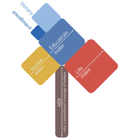
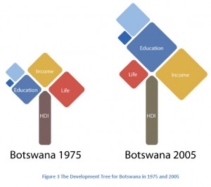
This year's 20th anniversary edition included visual explorations of the Human Development Index as a way to better understand the information. One of these visualizations, the HDI tree, was developed by MIT Media Lab Assistant Professor César A. Hidalgo with the help of Northeastern University Professor of Design Isabel Meirelles and designers Geoffrey House and Dave Landry.
Learn more about Hidalgo's HDI tree (pdf), including an interesting chart comparing HDI changes for 35 African nations.
Here's how the tree works:
- The height of the tree trunk is proportional to the total value of a country's HDI.
- The size of the branches are proportional to the value of each HDI indicator and sub-indicator.
- The branches are sorted from left to right in increasing order.
- The color of the trunk equals the weighted average of the colors of the three components.


