
Data USA: Visualizations Reveal Trends Fast
-
-
slice.mit.edu
Filed Under


Studying numbers may not be the best way to unlock deep meaning from massive data sets.
The treasures buried in Big Data can appear faster and clearer through a growing body of visualization tools that illustrate trends, concentrations, and anomalies. MIT’s César A. Hidalgo is leading a revolution in how data can be parsed visually and his new project is Data USA, a collaboration with his Media Lab group, Deloitte, and Datawheel.
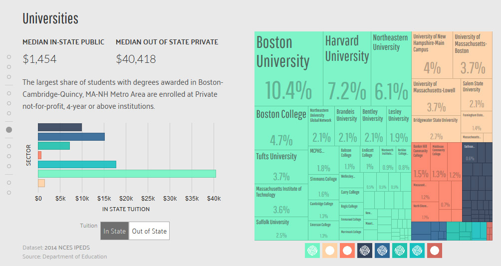
The mission of Data USA is to make the massive data more useful by creating the “most comprehensive website and visualization engine of public US Government data.” That means through this single source, executives can get new insights about customers, recent college grads can find the best locations for their interests and skills, or health professionals can pin down disease patterns across the country. And it is free and open source, so custom applications are easy to develop.
Hidalgo, an associate professor who leads the MIT Media Lab’s Macro Connections group, has an ambitious goal: to help raise living standards around the world by improving the understanding of prosperity and how it evolves. The author of Why Information Grows: The Evolution of Order, from Atoms to Economies, Hidalgo was named a World Economic Forum Young Global Leader.

Do your own data digging in some of Macro Connection’s other projects:
The Observatory of Economic Complexity offers international trade data for every country and product for more than fifty years.
DataViva provides data for every municipality, industry, occupation, and educational establishment in Brazil.
Immersion is a people-centric visualization of email metadata that allows users to explore their own web of interactions.
Pantheon is a data visualization engine focusing on globally famous historical characters.


