
Data That Mesmerizes: Senseable City Lab Unveils Obama Inauguration Visualizations
-
-
slice.mit.edu
- 4
Filed Under

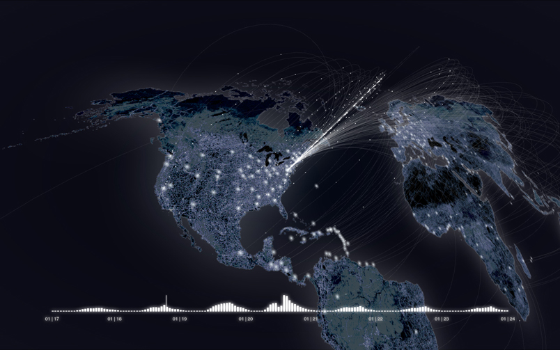
Right around the time that Obama hit his 100th day in office, MIT's senseable city lab released a series of data visualizations depicting, among other things, fluctuations in call activity recorded during Obama's inaugural address in January. Take a look at the video below to see how call activity changed—who was calling whom, how locations shifted over time—and, perhaps of equal import, how unusually beautiful reams of otherwise dull cell phone data can become.
[youtube=http://www.youtube.com/watch?v=PKeGt_BjBK4&eurl=http%3A%2F%2Fgizmodo.com%2F5270200%2Fwatch-the-world-lit-up-by-millions-of-voices-during-obamas-inauguration&feature=player_embedded]
If you're hooked on the visualizations and want to see more, visit the senseable city lab Obama/One People Web site or check out the site (specifically the mapping section) from MOMA's "Design and the Elastic Mind" exhibit.
Comments
MD
Mon, 06/15/2009 8:20pm
I wonder if there's any way to do a similar visualization of the twitter/phone communications from Iran within the past couple of days??
Dennis Oleary
Mon, 06/01/2009 3:38pm
looked great..but have to agree..data didnt really "pop" for me...here's another view point...during the address people turned off their TV and made calls they had out off to watch "lost"
Dan Greenberg
Mon, 06/01/2009 10:22am
I second Elroy. I guess the visualization really does not come through on YouTube. It would be helpful if the text -- insightful things like "call volume returns to normal" -- were more readable.
Elroy Pearson
Mon, 06/01/2009 9:56am
Call me crazy, but I can't tell anything about activity levels on the pretty world map. The bar chart on the bottom is much more telling.