Thomas D. Schneider 1 2 and R. Michael Stephens1
version = 1.55 of logopaper.tex 1999 August 5
Nucleic Acids Research, 18: 6097-6100 (1990)
A graphical method is presented for displaying the patterns in a set of aligned sequences. The characters representing the sequence are stacked on top of each other for each position in the aligned sequences. The height of each letter is made proportional to its frequency, and the letters are sorted so the most common one is on top. The height of the entire stack is then adjusted to signify the information content of the sequences at that position. From these `sequence logos', one can determine not only the consensus sequence but also the relative frequency of bases and the information content (measured in bits) at every position in a site or sequence. The logo displays both significant residues and subtle sequence patterns.
INTRODUCTION A logo is ``a single piece of type bearing two or more usually separate elements'' [1]. In this paper, we use logos to display aligned sets of sequences. Sequence logos concentrate the following information into a single graphic [2]:
CREATION OF BINDING SITE LOGOS To create a logo from a set of sequences, the sequences are first aligned relative to one another. For example, a set of ribosome binding sequences can be aligned at the translational initiation point [3]. A table of frequencies of each base at each position is then constructed. The frequency table is examined at each individual position and sorted by the frequency of bases. The most frequent base, called the ``consensus'' base, appears on the top of the final graphic and is commonly used to represent the pattern of a sequence [4]. However, a consensus sequence does not represent all the information in the sequences since in many cases other bases also appear at a significant frequency. For example, the procaryotic initiation codon, which is predominantly AUG, also has GUG and UUG on occasion. If one ignores these possibilities, one has distorted the data. This is one of several reasons why the consensus sequence is a poor model for binding sites [5,6].
The importance of a particular position in a binding site is more clearly and consistently given by the information required to describe the pattern there [7,8]. To choose one symbol or state from two equally likely possibilities requires one ``bit'' of information. For example, to communicate the result of a coin-flip to someone requires 1 bit of information because only one yes-no question needs to be answered: ``Is it heads?''. If a position in a binding site always contains one base (e.g. G), then we need exactly two bits of information since two yes-no questions need to be answered: ``Is it A or G?'' (i.e. is it a purine?) and ``Is it A or C?''. (If the answers to both questions are ``no'', it must be a T.) Furthermore, if a position contains two bases (e.g. sometimes A and sometimes G), only one question suffices since a two out of four choice is equivalent to a one out of two choice. Therefore, only one bit is needed to describe a position in a binding site that contains only purines, but two bits are needed to describe a position that always contains adenine.
If the frequencies of bases are not exactly equi-probable, then a more
sophisticated calculation is needed to find the average information
at a position.
In 1948, Claude Shannon showed how to do this
[7,8]. Following Shannon,
we define the uncertainty measure as:
 |
(1) |
| (2) |
The entire set of
Rsequence(l) values forms a curve that represents the
importance of
various positions in the binding site
[9,10,11].
The height of this curve is the height
of the logo at that position. The size of each base printed in a logo is
determined by multiplying the frequency of that base by
the total information at that position:
| (3) |
The logos as we have described them do not account for the spacing between parts of a binding site, as with ribosome binding sites (Shine and Dalgarno to initiation codon) or procaryotic promoters (-35 to -10). When a binding site has two parts, it is possible to align both portions and create a logo for each. The spacing could be indicated by a histogram that shows the frequency distribution of the spacing. Alternatively, a logo could be created for each spacing. Since variable spacing reduces the overall information content of a pattern, the length of a downward pointing arrow could be used to indicate the amount of pattern reduction. (See the discussion of this issue in [9].)
In cases where there are few sequences, a meaningful logo cannot be made. One sequence does not tell anything about the pattern that is recognized and the sampling correction will force the logo to be completely flat [9]. However, an experimental technique has been devised which can be used to determine the frequency table f(b, l) from synthetically created binding sites [12], and this can be used to create the logo (Figure 3).
In the case of protein sequences, we use the formulation
| (4) |
Gaps are introduced into protein sequences when they are aligned [13]. To avoid confusion with the small sample size problem discussed above, suppose that we had an alignment of 106 sequences, and that at one position 90% had a gap inserted and the remaining 10% had a P. Such a position would appear in the logo as strongly conserved, even though it exists in only a small fraction of the sequences. To avoid being fooled by such cases, they are suppressed by adjusting the height of the stack of letters by the proportion of the data available. Thus the P would be reduced to 10% of its unsuppressed height.
Logos were created using the Pascal
[14]
programs of the Delila system
[15,16].
All programs described here are available on various media,
including
magnetic tape,
floppy disk,
electronic mail (contact: toms@alum.mit.edu)
and
internet file transfer protocol (ftp ncifcrf.gov, password:
anonymous, in directory pub/delila).
Information curves for DNA and RNA sequences were calculated by the
Rseq and Sites programs according to the methods given in
[9,10,12]
and converted to a useable format
using a program called Dalvec.
Information curves for aligned protein sequences were calculated
by a program called Alpro.
The MakeLogo program sorts the
bases or amino acids given by Dalvec or Alpro
by their frequency
and produces the logo in the graphics language
PostScript
![]() [17,18].
Each character in the logo can be assigned a color, and can be drawn
filled-in or as an outline.
The vertical sizes of
C, G and the bar (
[17,18].
Each character in the logo can be assigned a color, and can be drawn
filled-in or as an outline.
The vertical sizes of
C, G and the bar (|) characters
were adjusted to match the sizes of A and T
since C, G and |
extend above and below
A and T in the Helvetica-Bold font we used.
To allow for proteins and other sequences,
O, Q, S, J and U were also adjusted.
Outline fonts were clipped so that they would stay
within the bounds of these adjusted sizes.
The logos were printed on an Apple
![]() Laserwriter
Laserwriter
![]() IIntx.
IIntx.
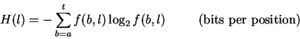
INTERPRETATION OF BINDING SITE LOGOS Logos contain several different types of information. First, at each position the bases are arranged in order of predominance from top to bottom, with the highest-frequency base being on top of the stack. The general consensus can be found by reading the top base at every position. In addition, the relative size of the individual bases shows the relative frequency of the four bases at a position. If a letter is large compared to the other letters in a column, then its frequency at that position is high. Conversely, letters that are small when compared to the others in their column have low frequencies. Relative letter sizes probably only have meaning in the column they reside in, although we note the curious consistency in height of the pyrimidines below the Shine and Dalgarno purines [19] in Figure 1. A similar effect is observed for the purines below the pyrimidine tract at the 3' ends of introns (in preparation).
The height of the entire stack is proportional to the information at that position in the binding site. The most important positions are easily spotted, yet subtle patterns can also be observed. For example, the reduction in the height of the first base of the initiation codon in Figure 1 reflects the presence of the alternative bases that appear below the A.
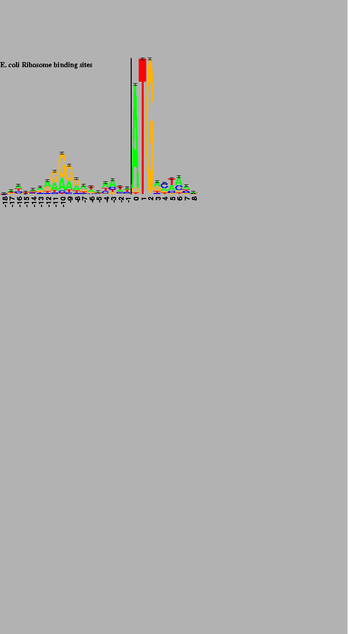
The logo in
Figure 2
shows the cI and cro binding
sites in bacteriophage ![]() .
It demonstrates that (for unknown reasons)
the bases in the binding site have alternatively varying importance.
To create this logo, both the sequences and their complements were used,
so the resulting logo shows dyad symmetry about the central base.
.
It demonstrates that (for unknown reasons)
the bases in the binding site have alternatively varying importance.
To create this logo, both the sequences and their complements were used,
so the resulting logo shows dyad symmetry about the central base.
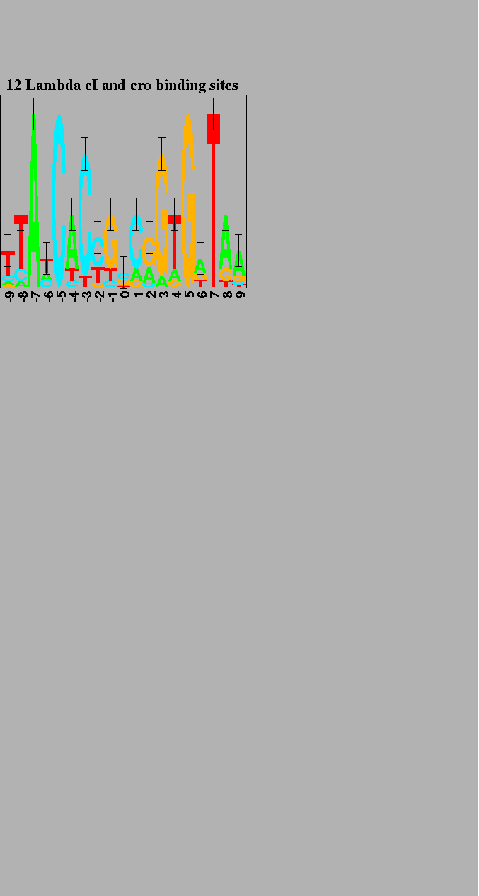
In comparison to the other binding sites, the pattern at T7 promoters in the phage genome is dense (Figure 3, upper logo) and contains more information than one would expect [9]. However, when an experiment is performed to determine what components are important to the RNA polymerase [12], only half of the pattern remains (Figure 3, lower logo). The excess pattern is thought to represent the binding site of another DNA binding protein [9]. The logos clearly show the difference between the pattern present in the phage genome and the pattern required by the T7 RNA polymerase alone.
Finally, logos can be used to display aligned protein sequences, as illustrated in Figure 4. The conservation of several internal hydrophobic amino acids [20] can easily be seen in this protein logo.
We thank Morton Schultz, Peter Lemkin, Denise Rubens, Michael Yarmolinsky, Peter Rogan, Jeffrey Strathern, Doug Halverson, and Hugo Martinez for their comments on the manuscript, Joseph Mack for supplying the aligned globin sequences, Eric Miller for pointing out the graphical technique devised by Reznikoff and McClure [4] and the members of the Advanced Scientific Computing Laboratory for their technical support. R. M. Stephens was supported by the NCI/FCRDC Student Intern Program and the NIH/FAES Mones Berman Memorial Fund.
Only -18 to +8 of the -20 to +13 site is shown. The first translated codon is just to the right of the 2 bit high vertical bar. 149 natural sites were used to create the logo [9]. |
The 6 natural operators and their complementary sequences were used to create the logo [9]. |
The first transcribed base is just to the right of the 2 bit high vertical bars. The 17 natural promoter regions were used to generate the upper logo [9]. 53 promoter variants were used to generate the lower logo [12]. |
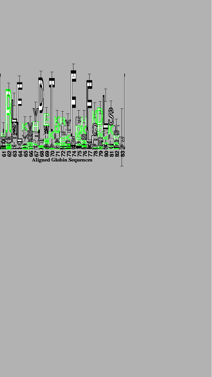
The alignment was performed by the program described by Hein [13] with the weight of an insertion-deletion of length k being 8 + 3 k. The 56 globin sequences supplied with the program were used. The logo is of the conserved packing and sliding contacts at the end of the B through the beginning of the D helices of the globins [21]. The vertical bar is 3 bits high. Although outlined characters take longer to draw, they are easier to distinguish from one another when there are more than 4 characters. For example, an F on top of an L is distinguishable from a long E. As a substitute for color, external polar (N and Q) and charged (D, E, K, R and H) amino acids are lightly stippled while ambivalent (P, T, S, C, A, G, Y and W) and internal non-polar (F, L, I, M and V) amino acids are black [21]. |